

|
|
 |
|
#1
 04-01-2012, 05:40 PM
|
||||
|
||||
|
Good article in Rolling Stone. As an aside that proves the point, campaign finance reveals show that only 17 billionaires are funding more than 50% of all Republican donations this primary season.
We have 300,000,000 citizens. 17 have major control over who becomes President of the United States. How the GOP Became the Party of the Rich The inside story of how the Republicans abandoned the poor and the middle class to pursue their relentless agenda of tax cuts for the wealthiest one percent Read more: http://www.rollingstone.com/politics...#ixzz1qpYuTTwI Quote:
__________________
"Have the clean racing people run any ads explaining that giving a horse a Starbucks and a chocolate poppyseed muffin for breakfast would likely result in a ten year suspension for the trainer?" - Dr. Andrew Roberts Last edited by Riot : 04-01-2012 at 06:26 PM. 
|
|
#2
04-02-2012, 02:30 PM
|
||||
|
||||
|
Bull.
The GOP represents everyone NOT getting a subsidy check from the government. You should be asking "How did the Democrats became the food stamp, welfare, SSI, medicaid, medicare, family-destroying party?", and in a two party system, where is everyone not represented in that sentence going to throw their support? Especially since everyone not represented in that sentence is PAYING for EVERYTHING.
|
|
#3
04-02-2012, 02:35 PM
|
||||
|
||||
|
Quote:
__________________
GOP- Protecting Pedophiles since 2025
|
|
#4
04-02-2012, 02:42 PM
|
||||
|
||||
|
Quote:
|
|
#5
04-02-2012, 04:33 PM
|
||||
|
||||
|
Quote:
The poorest states, the states with the most citizens on government assistance, both state and federal, are states that vote strongly Republican. Here's a map where the states that take more in federal government assistance than they pay in taxes, the biggest "welfare states", are in red: 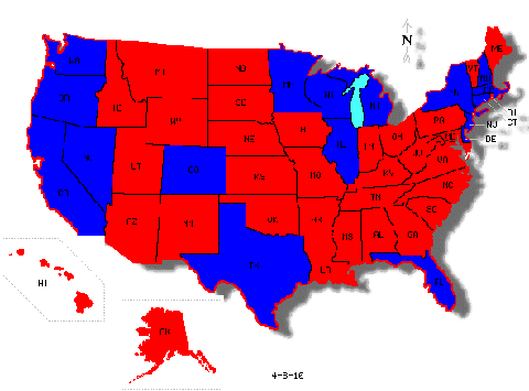 Here's a map of the way the states voted in the 2009 Presidential. Red is Republican: 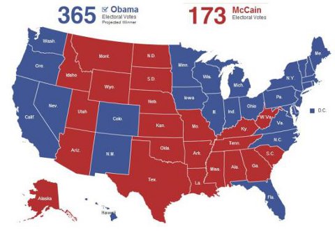
__________________
"Have the clean racing people run any ads explaining that giving a horse a Starbucks and a chocolate poppyseed muffin for breakfast would likely result in a ten year suspension for the trainer?" - Dr. Andrew Roberts
|
|
#6
04-02-2012, 05:07 PM
|
|||
|
|||
|
Quote:
__________________
don't run out of ammo.
|
|
#7
04-02-2012, 05:43 PM
|
||||
|
||||
|
Quote:
Whatever way you calculate it, it is the poorest states that have the most children on welfare, adults on welfare, both on Medicaid, food stamps, etc. Those are the red states that vote Republican.
__________________
"Have the clean racing people run any ads explaining that giving a horse a Starbucks and a chocolate poppyseed muffin for breakfast would likely result in a ten year suspension for the trainer?" - Dr. Andrew Roberts
|
|
#8
04-02-2012, 05:53 PM
|
|||
|
|||
|
Quote:
__________________
don't run out of ammo.
|
|
#9
04-02-2012, 05:55 PM
|
|||
|
|||
|
Quote:
No shot they do not have the highest numbers of people on some form of assistance.
__________________
don't run out of ammo.
|
|
#10
04-02-2012, 05:55 PM
|
||||
|
||||
|
http://www.statemaster.com/graph/eco...tal-recipients
Welfare only (not food or medical assistance) in absolute population numbers (not percentage of population) Rank States Amount # 1 California: 1,085,627 # 2 New York: 341,004 # 3 Texas: 333,435 # 4 Pennsylvania: 207,429 # 5 Michigan: 202,469 # 6 Ohio: 188,108 # 7 Tennessee: 180,466 # 8 Washington: 140,721 # 9 Indiana: 140,571 # 10 Georgia: 132,003 # 11 Florida: 119,080 # 12 Arizona: 111,334 # 13 Missouri: 108,561 # 14 Massachusetts: 108,469 # 15 New Jersey: 101,854 # 16 Illinois: 99,952 # 17 Minnesota: 93,665 # 18 North Carolina: 83,906 # 19 Kentucky: 76,688 # 20 Virginia: 70,199 # 21 Maryland: 62,066 # 22 Louisiana: 56,157 # 23 Puerto Rico: 54,544 # 24 Iowa: 51,713 # 25 South Carolina: 48,028
__________________
"Have the clean racing people run any ads explaining that giving a horse a Starbucks and a chocolate poppyseed muffin for breakfast would likely result in a ten year suspension for the trainer?" - Dr. Andrew Roberts
|
|
#11
04-02-2012, 05:57 PM
|
||||
|
||||
|
Quote:
__________________
"Have the clean racing people run any ads explaining that giving a horse a Starbucks and a chocolate poppyseed muffin for breakfast would likely result in a ten year suspension for the trainer?" - Dr. Andrew Roberts
|
|
#12
04-02-2012, 05:58 PM
|
|||
|
|||
|
Quote:
Cali and NY alone account for as much as just about every red state on here.
__________________
don't run out of ammo.
|
|
#13
04-02-2012, 06:04 PM
|
||||
|
||||
|
Quote:
The states who have the greatest living off the largess of others, living off government programs of welfare, food aid, Medicaid, taking out more than they put in, are the poorest states, and are those that tend to vote Republican. Jesus said help thy neighbors. Give to the poor. Worry about the least of these. The red states, who happen to also be the most religious states, certainly willingly take welfare help from the rich states. And you know? We, as a country, should help our poor and starving. And it doesn't take religion, plenty of atheists are generous to those in need. There is nothing wrong with that. That is not evil, or bad. Welfare reform in the 1990's eliminated lifetime welfare "queens" (something created out of thin air by Ronald Reagan, btw, for a campaign theme)
__________________
"Have the clean racing people run any ads explaining that giving a horse a Starbucks and a chocolate poppyseed muffin for breakfast would likely result in a ten year suspension for the trainer?" - Dr. Andrew Roberts
|
|
#14
04-02-2012, 06:15 PM
|
||||
|
||||
|
Joey and Clip-Clop: what did you think of the Rolling Stone article, and the history of the modern Republican party?
__________________
"Have the clean racing people run any ads explaining that giving a horse a Starbucks and a chocolate poppyseed muffin for breakfast would likely result in a ten year suspension for the trainer?" - Dr. Andrew Roberts
|
|
#15
04-03-2012, 01:01 PM
|
|||
|
|||
|
Quote:
The article was a bit opinion laden for my tastes but for the most part an accurate portrayal. I would have appreciated the author possibly mentioning that during his first two years in office with control over the house and senate the Obama White House did absolutely nothing to counter-act what they criticized all along.
__________________
don't run out of ammo.
|
|
#16
04-03-2012, 03:45 PM
|
||||
|
||||
|
Quote:
The party of educated, thoughtful conservatism as lead by William F. Buckley Jr. has become ... Glenn Beck and Hannity screeching about evil elites.
__________________
"Have the clean racing people run any ads explaining that giving a horse a Starbucks and a chocolate poppyseed muffin for breakfast would likely result in a ten year suspension for the trainer?" - Dr. Andrew Roberts
|


 Linear Mode

