Derby Trail Forums

Go Back   Derby Trail Forums > Triple Crown Topics/Archive..
Register FAQ Members List Calendar Search Today's Posts Mark Forums Read

View Poll Results: Best Triple Crown artwork?
Kentucky Derby 3 4.41%
Preakness Stakes 14 20.59%
Belmont Stakes 32 47.06%
None.. They're all lousy 8 11.76%
Something Pillow Pants might paint 11 16.18%
Voters: 68. You may not vote on this poll

Reply
 
Thread Tools Display Modes
  #1  
Old 02-15-2008, 04:23 AM
Kasept's Avatar
Kasept Kasept is online now
Steve Byk
 
Join Date: May 2006
Location: Greenwich, NY
Posts: 43,740
Default


Belmont 140 logo begins concept of honoring previous year's winner by incorporating colors of that stable/owner...

STORY: http://news.bloodhorse.com/viewstory.asp?id=43640


__________________
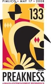
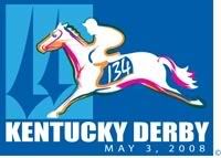
All ambitions are lawful except those which climb upward on the miseries or credulities of mankind. ~ Joseph Conrad
A long habit of not thinking a thing wrong, gives it a superficial appearance of being right. ~ Thomas Paine
Don't let anyone tell you that your dreams can't come true. They are only afraid that theirs won't and yours will. ~ Robert Evans
Reply With Quote
  #2  
Old 02-15-2008, 05:16 AM
kenny p kenny p is offline
Golden Gate
 
Join Date: Jun 2006
Posts: 393
Default

I like the idea of incorporating the previous years winners colors. Thats what Espositos on Plainfield Ave. used to do. They would paint the fence and the trim every year to match the colors of the Stakes winner. KP
Reply With Quote
  #3  
Old 02-15-2008, 05:37 AM
Hickory Hill Hoff's Avatar
Hickory Hill Hoff Hickory Hill Hoff is offline
Newmarket
 
Join Date: May 2006
Location: the "Sand Flats"
Posts: 6,903
Default

I like things simple, nothing fancy.....the Belmont Stakes logo is that.
__________________
"Change can be good, but constant change shows no direction"

http://www.hickoryhillhoff.blogspot.com/
Reply With Quote
  #4  
Old 02-15-2008, 05:49 AM
ddthetide's Avatar
ddthetide ddthetide is offline
Arlington Park
 
Join Date: Jun 2006
Location: western maryland
Posts: 4,230
Default

Quote:
Originally Posted by Hickory Hill Hoff
I like things simple, nothing fancy.....the Belmont Stakes logo is that.
i like it but that race was good enough to have curlin in the logo too.
__________________
"Always keep your heads up and act like champions."
Coach Paul Bryant
Reply With Quote
  #5  
Old 02-15-2008, 06:22 AM
Hickory Hill Hoff's Avatar
Hickory Hill Hoff Hickory Hill Hoff is offline
Newmarket
 
Join Date: May 2006
Location: the "Sand Flats"
Posts: 6,903
Default

Quote:
Originally Posted by ddthetide
i like it but that race was good enough to have curlin in the logo too.
So true also because I wagered on him that day
__________________
"Change can be good, but constant change shows no direction"

http://www.hickoryhillhoff.blogspot.com/
Reply With Quote
  #6  
Old 02-15-2008, 07:08 AM
philcski's Avatar
philcski philcski is offline
Goodwood
 
Join Date: Jun 2006
Location: Mission Viejo, CA
Posts: 8,872
Default

I really like the Belmont Stakes logo but they could have done a better job of capturing Rags to Riches' trademark blaze rather than using a generic-looking dark chestnut with the Tabor silks.
__________________
please use generalizations and non-truths when arguing your side, thank you
Reply With Quote
  #7  
Old 02-15-2008, 07:49 AM
slotdirt's Avatar
slotdirt slotdirt is offline
Atlantic City Race Course
 
Join Date: May 2006
Posts: 4,894
Default

The Preakness logo actually looks really good compared to previous years, and it got my vote.
__________________
The world's foremost expert on virtually everything on the Redskins 2010 season: "Im going to go out on a limb here. I say they make the playoffs."
Reply With Quote
  #8  
Old 02-15-2008, 07:52 AM
sundaysilenceforever's Avatar
sundaysilenceforever sundaysilenceforever is offline
Cahokia Downs
 
Join Date: Mar 2007
Location: Littleton, CO
Posts: 162
Default

Quote:
Originally Posted by philcski
I really like the Belmont Stakes logo but they could have done a better job of capturing Rags to Riches' trademark blaze rather than using a generic-looking dark chestnut with the Tabor silks.
....and, make her more a bit more feminine looking.

I voted for Preakness though. Kinda cool retro thing going on...right up my alley!
__________________
There is something about the outside of a horse that is good for the inside of a man. ~Winston Churchill

http://video.nbcsports.com/player/?id=55577
Reply With Quote
  #9  
Old 02-15-2008, 09:20 AM
ptgiven ptgiven is offline
Sunshine Park
 
Join Date: May 2006
Location: Albany, NY
Posts: 85
Default

looks like they threw the belmont stakes logo together in 5 minutes!!! at least the derby and preakness logos look like there was some effort in it
Reply With Quote
  #10  
Old 02-15-2008, 09:35 AM
slotdirt's Avatar
slotdirt slotdirt is offline
Atlantic City Race Course
 
Join Date: May 2006
Posts: 4,894
Default

The Belmont logo does look at least a little low rent...
__________________
The world's foremost expert on virtually everything on the Redskins 2010 season: "Im going to go out on a limb here. I say they make the playoffs."
Reply With Quote
  #11  
Old 02-15-2008, 11:14 AM
Hickory Hill Hoff's Avatar
Hickory Hill Hoff Hickory Hill Hoff is offline
Newmarket
 
Join Date: May 2006
Location: the "Sand Flats"
Posts: 6,903
Default

Quote:
looks like they threw the belmont stakes logo together in 5 minutes!!! at least the derby and preakness logos look like there was some effort in it
Quote:
The Belmont logo does look at least a little low rent...
Just basic and simply...enough of the "artsy" stuff

...after all, it's just a "prep" for the Breeder's Cup Marathon race!
__________________
"Change can be good, but constant change shows no direction"

http://www.hickoryhillhoff.blogspot.com/
Reply With Quote
  #12  
Old 02-15-2008, 12:36 PM
sumitas sumitas is offline
Santa Anita
 
Join Date: Jun 2006
Posts: 3,362
Default

LOLOL, that is hilarious. A youtube moment of instant stardom lost.
Reply With Quote
  #13  
Old 02-15-2008, 02:16 PM
Merlinsky Merlinsky is offline
Santa Anita
 
Join Date: Sep 2006
Posts: 3,049
Default

Quote:
Originally Posted by Cardus
Did Picasso design the Preakness logo?

Personally, I'd rather have a Frank's Energy Drink-based Preakness logo, or a silhouette of a guy running atop porta-johns like we saw last year in the infield. It was borderline dangerous, but I got a good laugh out of it. American ingenuity at its finest!
I'll pass on something representative of Yum! Brands though. Glad there's not a drumstick on the KD logo.

They're okay but not great. I enjoy the idea of the Belmont logo but it looks like they hired a high school student to doodle it during homeroom. Preakness is a throwback which is interesting. The Derby logo is nice but not eye popping.
Reply With Quote
  #14  
Old 02-15-2008, 04:03 PM
ateamstupid's Avatar
ateamstupid ateamstupid is offline
Super Mod.. and Super Fly
 
Join Date: Jun 2006
Location: Brooklyn, NY
Posts: 13,036
Default

I can see that racing is emphasizing diversity. All three logos suck in different ways.
Reply With Quote
Reply


Thread Tools
Display Modes

Posting Rules
You may not post new threads
You may not post replies
You may not post attachments
You may not edit your posts

vB code is On
Smilies are On
[IMG] code is On
HTML code is Off
Forum Jump


All times are GMT -5. The time now is 05:49 AM.


Powered by vBulletin® Version 3.6.8
Copyright ©2000 - 2025, Jelsoft Enterprises Ltd.