Derby Trail Forums

Go Back   Derby Trail Forums > Triple Crown Topics/Archive..
Register FAQ Members List Calendar Today's Posts

Reply
 
Thread Tools Display Modes
  #1  
Old 02-06-2009, 01:01 PM
SniperSB23 SniperSB23 is offline
Hialeah Park
 
Join Date: Jun 2006
Location: Albany, NY
Posts: 6,086
Default Belmont Stakes Logo

Sorry if this has already been posted but I couldn't find it.

I think it's the first logo I've seen that I actually like:

http://www.nyra.com/saratoga/stories/Jan302009.shtml
Reply With Quote
  #2  
Old 02-06-2009, 01:04 PM
Rudeboyelvis Rudeboyelvis is offline
Belmont Park
 
Join Date: Nov 2006
Posts: 7,440
Default

Quote:
Originally Posted by SniperSB23
Sorry if this has already been posted but I couldn't find it.

I think it's the first logo I've seen that I actually like:

http://www.nyra.com/saratoga/stories/Jan302009.shtml
That's pretty shi tty
Reply With Quote
  #3  
Old 02-06-2009, 01:08 PM
Travis Stone's Avatar
Travis Stone Travis Stone is offline
Oaklawn
 
Join Date: Sep 2006
Location: Louisiana
Posts: 2,229
Default

I think it's an awesome logo...
Reply With Quote
  #4  
Old 02-06-2009, 01:09 PM
MaTH716's Avatar
MaTH716 MaTH716 is offline
Flemington
 
Join Date: Nov 2006
Location: Jersey
Posts: 11,437
Default

I think it's pretty sharp. I like the NYC skyline, but then again I'm a bit biased.
__________________
Felix Unger talking to Oscar Madison: "Your horse could finish third by 20 lengths and they still pay you? And you have been losing money for all these years?!"
Reply With Quote
  #5  
Old 02-06-2009, 01:13 PM
Kasept's Avatar
Kasept Kasept is offline
Steve Byk
 
Join Date: May 2006
Location: Greenwich, NY
Posts: 42,612
Default

Throwback style Belmont logo. Clean and simple... I always like when they use the Belmont tree image.
__________________
All ambitions are lawful except those which climb upward on the miseries or credulities of mankind. ~ Joseph Conrad
A long habit of not thinking a thing wrong, gives it a superficial appearance of being right. ~ Thomas Paine
Don't let anyone tell you that your dreams can't come true. They are only afraid that theirs won't and yours will. ~ Robert Evans
Reply With Quote
  #6  
Old 02-06-2009, 01:18 PM
Antitrust32 Antitrust32 is offline
Jerome Park
 
Join Date: May 2006
Location: Ft Lauderdale
Posts: 9,413
Default

I would really like to see a tree that size in NYC. That would be cool.
__________________
Quote:
Originally Posted by Riot View Post
Can I start just making stuff up out of thin air, too?
Reply With Quote
  #7  
Old 02-06-2009, 01:29 PM
parsixfarms parsixfarms is offline
Churchill Downs
 
Join Date: Mar 2007
Location: Saratoga Springs
Posts: 1,779
Default

It's cool.
Reply With Quote
  #8  
Old 02-06-2009, 01:50 PM
Echo Farm's Avatar
Echo Farm Echo Farm is offline
Ellis Park
 
Join Date: Nov 2006
Location: FL
Posts: 464
Default

Quote:
Originally Posted by Kasept
Throwback style Belmont logo. Clean and simple... I always like when they use the Belmont tree image.
I like the tree, but wish they had included a horse in the logo. A couple of the buildings on the skyline look too much like hypodermic needles to me.

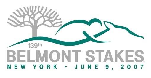
This one was nice, and lends itself well to print, screenprinting or embroidery.
__________________
"We are buried beneath the weight of information, which is being confused with knowledge; quantity is being confused with abundance and wealth with happiness. We are monkeys with money and guns. " ~ Tom Waits
Reply With Quote
  #9  
Old 02-06-2009, 03:01 PM
ateamstupid's Avatar
ateamstupid ateamstupid is offline
Super Mod.. and Super Fly
 
Join Date: Jun 2006
Location: Brooklyn, NY
Posts: 13,036
Default

I like the tree over the city, but what happened to making the colors of the Belmont/Travers logo the colors of the previous year's winner? I thought that was a cool idea, but apparently it's only when NYRA likes your silks colors?
Reply With Quote
  #10  
Old 02-06-2009, 05:41 PM
Danzig's Avatar
Danzig Danzig is offline
Dee Tee Stables
 
Join Date: May 2006
Location: The Natural State
Posts: 29,931
Default

Quote:
Originally Posted by SniperSB23
Sorry if this has already been posted but I couldn't find it.

I think it's the first logo I've seen that I actually like:

http://www.nyra.com/saratoga/stories/Jan302009.shtml

i clicked on the link, where's the logo? all i saw was some blue buildings and tree....
Reply With Quote
  #11  
Old 02-06-2009, 07:26 PM
philcski's Avatar
philcski philcski is offline
Goodwood
 
Join Date: Jun 2006
Location: Mission Viejo, CA
Posts: 8,872
Default

Quote:
Originally Posted by ateamstupid
I like the tree over the city, but what happened to making the colors of the Belmont/Travers logo the colors of the previous year's winner? I thought that was a cool idea, but apparently it's only when NYRA likes your silks colors?
i forgot who won last year...
__________________
please use generalizations and non-truths when arguing your side, thank you
Reply With Quote
  #12  
Old 02-06-2009, 07:36 PM
MaTH716's Avatar
MaTH716 MaTH716 is offline
Flemington
 
Join Date: Nov 2006
Location: Jersey
Posts: 11,437
Default

Quote:
Originally Posted by philcski
i forgot who won last year...

Casino Dr....Oh wait. ummmmmm.
__________________
Felix Unger talking to Oscar Madison: "Your horse could finish third by 20 lengths and they still pay you? And you have been losing money for all these years?!"
Reply With Quote
  #13  
Old 02-06-2009, 08:01 PM
Rudeboyelvis Rudeboyelvis is offline
Belmont Park
 
Join Date: Nov 2006
Posts: 7,440
Default

[quote=Echo Farm]I like the tree, but wish they had included a horse in the logo. A couple of the buildings on the skyline look too much like hypodermic needles to me.


I agree completely. The tree is three times the freaking size of what apparently is supposed to be the Empire State Building, the skyline looks nothing like the skyline, the colors are atrocious, and the font is nothing similar to what one would associate Belmont Park with. It looks like a third grader drew a picture of a third grader throwing up on a bad cartoon of NY. Sorry.
Reply With Quote
  #14  
Old 02-06-2009, 09:34 PM
sdjcom's Avatar
sdjcom sdjcom is offline
Oaklawn
 
Join Date: Oct 2007
Posts: 2,163
Default Belmont logo

The race is run in 1st week of June, late spring by the calender. the tree looks winter barren, the colors reflect nothing of this time of year, and a piss-poor silouette of the city. Who could possibly give the final ok on this choice.
Un believeable.. and one more thing the logo makes NYC looks like it's on a hilltop, looking up at the city ,laughable
Reply With Quote
  #15  
Old 02-06-2009, 09:43 PM
Echo Farm's Avatar
Echo Farm Echo Farm is offline
Ellis Park
 
Join Date: Nov 2006
Location: FL
Posts: 464
Default

[quote=Rudeboyelvis]
Quote:
Originally Posted by Echo Farm
I like the tree, but wish they had included a horse in the logo. A couple of the buildings on the skyline look too much like hypodermic needles to me.

I agree completely. The tree is three times the freaking size of what apparently is supposed to be the Empire State Building, the skyline looks nothing like the skyline, the colors are atrocious, and the font is nothing similar to what one would associate Belmont Park with. It looks like a third grader drew a picture of a third grader throwing up on a bad cartoon of NY. Sorry.
this is another of the artist's creations:


At least if this guy had been local it may have been understandable, but the artist is from Atlanta. After looking at his work, it seems that he just assembles clipart and internet images.
http://www.artdesignstudios.net/
__________________
"We are buried beneath the weight of information, which is being confused with knowledge; quantity is being confused with abundance and wealth with happiness. We are monkeys with money and guns. " ~ Tom Waits
Reply With Quote
  #16  
Old 02-06-2009, 09:44 PM
ateamstupid's Avatar
ateamstupid ateamstupid is offline
Super Mod.. and Super Fly
 
Join Date: Jun 2006
Location: Brooklyn, NY
Posts: 13,036
Default

Quote:
Originally Posted by sdjcom
The race is run in 1st week of June, late spring by the calender. the tree looks winter barren, the colors reflect nothing of this time of year, and a piss-poor silouette of the city. Who could possibly give the final ok on this choice.
Un believeable.. and one more thing the logo makes NYC looks like it's on a hilltop, looking up at the city ,laughable


It's just a logo.
Reply With Quote
  #17  
Old 02-06-2009, 09:47 PM
sdjcom's Avatar
sdjcom sdjcom is offline
Oaklawn
 
Join Date: Oct 2007
Posts: 2,163
Default

From Atlanta???? you have got to be kidding. 10 million New yorkers, and they could.nt find a commercial artist with taste.
Reply With Quote
  #18  
Old 02-06-2009, 09:50 PM
sdjcom's Avatar
sdjcom sdjcom is offline
Oaklawn
 
Join Date: Oct 2007
Posts: 2,163
Default

Quote:
Originally Posted by ateamstupid


It's just a logo.
that reflects one of the oldest most treasured track and races in the country, imo it's matters a lot, but i like tradition.
Reply With Quote
  #19  
Old 02-06-2009, 09:58 PM
MaTH716's Avatar
MaTH716 MaTH716 is offline
Flemington
 
Join Date: Nov 2006
Location: Jersey
Posts: 11,437
Default

Quote:
Originally Posted by sdjcom
The race is run in 1st week of June, late spring by the calender. the tree looks winter barren, the colors reflect nothing of this time of year, and a piss-poor silouette of the city. Who could possibly give the final ok on this choice.
Un believeable.. and one more thing the logo makes NYC looks like it's on a hilltop, looking up at the city ,laughable
I'm from NY and I like it. You ever hear the phrase "less is more". It's a very clean, sharp logo. The NY skyline and the tree that represents Belmont. What else would you want?
__________________
Felix Unger talking to Oscar Madison: "Your horse could finish third by 20 lengths and they still pay you? And you have been losing money for all these years?!"
Reply With Quote
  #20  
Old 02-06-2009, 10:00 PM
Danzig's Avatar
Danzig Danzig is offline
Dee Tee Stables
 
Join Date: May 2006
Location: The Natural State
Posts: 29,931
Default

Quote:
Originally Posted by MaTH716
I'm from NY and I like it. You ever hear the phrase "less is more". It's a very clean, sharp logo. The NY skyline and the tree that represents Belmont. What else would you want?
maybe a horse?
Reply With Quote
Reply


Posting Rules
You may not post new threads
You may not post replies
You may not post attachments
You may not edit your posts

vB code is On
Smilies are On
[IMG] code is On
HTML code is Off
Forum Jump


All times are GMT -5. The time now is 02:42 PM.


Powered by vBulletin® Version 3.6.8
Copyright ©2000 - 2024, Jelsoft Enterprises Ltd.