
 |
 |
 |
|
|
|
#1
|
|||
|
|||
|
[quote=Echo Farm]I like the tree, but wish they had included a horse in the logo. A couple of the buildings on the skyline look too much like hypodermic needles to me.
I agree completely. The tree is three times the freaking size of what apparently is supposed to be the Empire State Building, the skyline looks nothing like the skyline, the colors are atrocious, and the font is nothing similar to what one would associate Belmont Park with. It looks like a third grader drew a picture of a third grader throwing up on a bad cartoon of NY. Sorry. |
|
#2
|
||||
|
||||
|
The race is run in 1st week of June, late spring by the calender. the tree looks winter barren, the colors reflect nothing of this time of year, and a piss-poor silouette of the city. Who could possibly give the final ok on this choice.
Un believeable.. and one more thing the logo makes NYC looks like it's on a hilltop, looking up at the city ,laughable |
|
#3
|
||||
|
||||
|
Quote:
 It's just a logo. |
|
#4
|
||||
|
||||
|
Quote:
|
|
#5
|
||||
|
||||
|
Quote:
__________________
Felix Unger talking to Oscar Madison: "Your horse could finish third by 20 lengths and they still pay you? And you have been losing money for all these years?!" |
|
#6
|
|||
|
|||
|
Quote:
|
|
#7
|
||||
|
||||
|
Quote:
__________________
"We are buried beneath the weight of information, which is being confused with knowledge; quantity is being confused with abundance and wealth with happiness. We are monkeys with money and guns. " ~ Tom Waits |
|
#8
|
||||
|
||||
|
Quote:
I prefer it when the image on a horse racing poster instantly makes anybody looking at it (not just long-time fans) realize it's about horse racing.
__________________
"Have the clean racing people run any ads explaining that giving a horse a Starbucks and a chocolate poppyseed muffin for breakfast would likely result in a ten year suspension for the trainer?" - Dr. Andrew Roberts |
|
#9
|
||||
|
||||
|
I'm afraid that most non New York horse players would not know the significance of this logo's symbolism.
At first glance I thought it was a giant moose in search of some big apples. Hey it is a one year logo..............it hardly matters. |
|
#10
|
||||
|
||||
|
Quote:

__________________
Felix Unger talking to Oscar Madison: "Your horse could finish third by 20 lengths and they still pay you? And you have been losing money for all these years?!" Last edited by MaTH716 : 02-07-2009 at 12:07 PM. |
|
#11
|
||||
|
||||
|
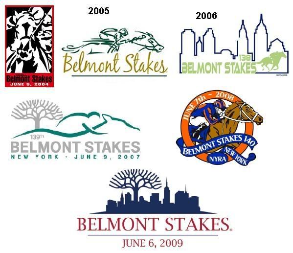
6 years of Belmont logos.
 Quite a variety
__________________
"We are buried beneath the weight of information, which is being confused with knowledge; quantity is being confused with abundance and wealth with happiness. We are monkeys with money and guns. " ~ Tom Waits |
|
#12
|
||||
|
||||
|
well, we all are giving our opinions, i think the 2007 log is more to the season
and has a jockey-horse to represent the race, along with the right colors. |
|
#13
|
||||
|
||||
|
Quote:
 |
|
#14
|
||||
|
||||
|
[quote=Rudeboyelvis]
Quote:
 At least if this guy had been local it may have been understandable, but the artist is from Atlanta. After looking at his work, it seems that he just assembles clipart and internet images. http://www.artdesignstudios.net/
__________________
"We are buried beneath the weight of information, which is being confused with knowledge; quantity is being confused with abundance and wealth with happiness. We are monkeys with money and guns. " ~ Tom Waits |
|
#15
|
||||
|
||||
|
From Atlanta???? you have got to be kidding. 10 million New yorkers, and they could.nt find a commercial artist with taste.
|
 |
| Thread Tools | |
| Display Modes | |
|
|