
|
Obligatory annual Derby/Oaks logo unveiling thread
 |
 |
Quote:
 |
Still better than the 2012 Summer Olympics Logo.
|
I like the Derby one, the Oaks...not so much. Too pink.
|
Oaks is sharp, Derby sucks...
|
Oaks makes me want to kill things.
|
Quote:
|
Quote:
Top heavy with the bolded 137... The horse head should be on the top... hell even if they just reversed the horse head and where it says Kentucky Derby it would improve it. I think they should do away with the date and the location? Come on do they really need to even say it? Makes it cluttered, everyone knows where it is. I like the other one. Wish there were just the slightest bit of movement in the horsie head so it didn't look like a chess piece but sure... it's fine. It, at least, has a sense of balance. |
Quote:
It would look even cooler with Blockateil (sp) perched on top... |
Quote:
Have Gun Will Travel with Paladin... this is first image that I thought of when I saw Oaks logo |
I guess the 126 lbs each Derby horse will carry includes a giant salad bowl on their head.
|
The Oaks logo seems to remind me of a promo for the Boris Spasky-Bobby Fischer chess match years ago.
|
Rain is in the forecast.:)
|
Quote:
The Derby logo is a mess of what appears to be an assemblage of clipart. The horse neck looks like a two lane highway. The reused rose in a horseshoe still looks like a swirling toilet bowl just after flushing. The chopped off 137 is bad, the date format is weird. Otherwise, it's a nice logo. Edit: I knew I had this somewhere:  |
Looks like last year with different coloration and a slight change in the arrangement.
|
Quote:
|
Awful. My wife does better graphic work for the invites for our annual derby party and she is a biologist.
|
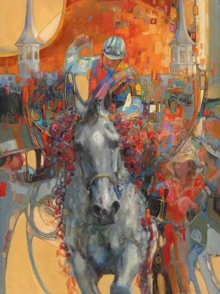
Derby 137 Poster Art
 |
Oaks 137 Poster Art
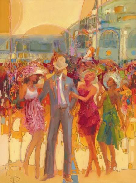 |
Better than usual, but, I'm pretty sure it won't be a grey winning the Derby.
|
What's the tittle of the Oaks poster,
"Pimpin ain't easy"? |
Quote:
|
Quote:
Yeah, but those girls in the picture don't exactly look the waitress type.................. |
Quote:
The girl on our right and the stud's left looks wasted. |
Derby poster is beautiful. The Oaks ... not so much, having a man the focus of the poster, and a horse not prominent.
|
Quote:
|
I want to like the Derby poster and almost do but the guy with the hat bothers me.
The Oaks poster? Quote:
That says it all. |
Quote:
|
Quote:
Why 3 women hanging on 1 man? The poster is for the Oaks. Should be 3 men hanging on 1 woman. |
Quote:
|
The Derby Poster Art...
 |
That looks more like Preakness poster art...
|
And the one guy is saying, hey I'm just trying to get out of the port-a-potties...:p
But the posters, I actually like the style but why in the oaks one is the horse not the main focal point, like the derby one..odd. Makes you wonder who sits around with the graphic artists and artists and says...YES..that's the one!!! |
Quote:
Quote:
I actually like the Derby poster. |
| All times are GMT -5. The time now is 08:49 AM. |
Powered by vBulletin® Version 3.6.8
Copyright ©2000 - 2025, Jelsoft Enterprises Ltd.